The oldest cave paintings in the world are about 40,000 years old.
Images of dots in Spain, Buffalo in France, and stenciled hands in Indonesia. These were painted by tribes thousands of miles and hundreds of years apart, but they all have one thing in common.
They are all red.
So starts our species fascination with the color. Red has a hold over us like no other pigment, signifying attraction, danger, boldness, and sex. In today’s world, it can symbolize love or hatred, courage or mistake depending on context, and we understand this context and meaning immediately, ready for flight or flight, or fun.
This in-built significance and symbolism to humans is a major boon to the designers of the world. No other color can convey so much meaning about a product or a brand. Many brands and designs use red to evoke certain emotions: excitement, passion, freshness, boldness.
Because of this symbolism and the fact red intuitively means so much to us, a lot of study has gone into own fascination with the color red, how it came to be so, how it plays with our emotions and desires, and what happens to us physiologically and psychologically when we see the color.
Use Red To Instill Desire
Red is inextricably linked with desire. Think about ruby red lipstick, a dozen red roses, or the woman in the red dress from The Matrix.
You might think that this is a cultural thing, that with colors having different meanings the world over, it is just western cultures that have come up with the idea that red means sex. But it seems this isn’t the case. Men feel the ‘red effect’ the world over.
A joint US/Canadian study studied a small, isolated community in Burkina Faso. What was particularly interesting about this tribe was that red usually had negative connotations in this group. For these Burkinabe, red meant bad luck and illness. But the young men of this community still found that red stoked their desire. When images of the same women were shown on a red background or a neutral background, the men always plumped for the red women. These findings replicate those from Europe and elsewhere in the world. Men just can’t get enough of red it seems.
Why probably goes back millions and millions of years, to before humans roamed the earth. Many of our ape cousins – Gorillas, Chimpanzees, Bonobos, and Orangutans – have two things in common: bare-skin and trichromatic vision.
We, along with some other higher primates can see in three colors – blue, green, and importantly red – whereas most animals only see blues and greens. Scientists think that once our ape-ancestors started to lose their hair, the possibility to see blood coursing through veins became an option. When females of many primate species are in peak fertility their skin reddens. Any male monkey with the ability to see this red, with his awesome tricolore eyes, was at an obvious advantage. Red became a signal for sexual peak, and our eyes evolved to pick these signals up.
It might have skipped your attention, but human females don’t go bright red when they are ovulating. So why is this still a thing? Well, it seems our brains just can’t let go of any idea that is so deeply ingrained. Another Canadian group looked at how women single their peak fertility time. Lo and behold, red flashed its lovely head once more.
The researchers found that women at a high conception risk were three times more likely to wear red than women at a low conception risk, and 77 per cent of women wearing red were found to be at peak fertility. There seems to be some unconscious signal that makes us pick out red to use as a visual cue whenever we are… in need.
Designers can, and do, take advantage of this. In fact, almost any advertisement, brand, or product that is meant to appeal to our baser instincts will come with a flash of red.
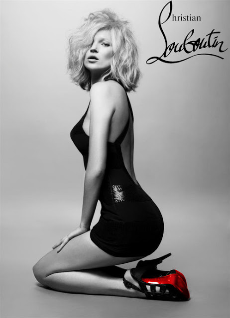
A great example of this is the red sole of the Louboutin shoe. Louboutin chose red because of its association with desire and passion. The bright, monochromatic red contrasts with the rest of the shoe, standing out and showing that the shoes are original Louboutins – other brands have tried to copy the design, but Louboutin trademarked the red sole in 2012.
Red Can Help You Win
Along with desire, we also associate red with dominance. Whereas a reddened face of our female primate ancestors signified attraction, a red-faced male meant aggression.
This is something that we definitely still see today. Whenever we get flustered, worked-up, and angry we go red, just like in the cartoons (sans steam out of the ears). Just seeing red can increase your heart rate, blood pressure and make you more excited.
Designers can take advantage of this excitement to bring people along on the emotional journey of their brand or product. An iconic use of red for excitement purposes is Ferrari. The association between excitement and red is no doubt why Enzo Ferrari chose the color for his classic race cars.

Because it gets our adrenaline pumping and is perceived as a sign of dominance, it might be no surprise that wearing red during sports can help you win.
Designers therefore need to take care when using the color red. It can have an immediate and unconscious effect on our bodily functions: raising heart rates and blood pressure, making us tense, and getting us ready to fight off all comers. Maybe not what you want on a website dedicated to relaxation, or a baby product then.
Red Can Make You Buy More, And Bid Higher
Because of its abilities to bypass rational thought and appeal straight to our primal brains, the effect of red on the commercial world has also been studied.
A lot of brands use red as their primary color and in their logos. The aforementioned Coca-Cola, along with other food and beverage companies such as Kellogg’s’ and Lays; oil companies such as Exxon and Texaco; supermarket chains such as Kmart and Target; and financial institutions such as Bank of America and Wells Fargo.
These companies want to be seen as brash and bold. They want to be thought of as vibrant and exciting. They also want their logos to catch your eye on the street and in their advertisements.
In 2011, a study into the effects of color and hue on product design by Lauren Labrecque and George Milne in the US, found that customers perceived red logos as ‘exciting’ and blue logos as ‘competent’. They also changed the color of otherwise identical packaging and then asked consumers what they thought about the product. When the packaging was purple people identified the product as sophisticated, whereas when it was a dark red they thought it was durable. The product they tested was condoms, in which case durability and reliability are probably a good thing.
Researchers have also looked at whether the lighting in a store has an effect on how much you buy. In a 1993 study, researchers found that whether the interior and an exterior lights of a store were red or blue could have a dramatic effect on how individuals felt about the store. Red was seen as ‘activating’, meaning it bought more shoppers into the store, but when they were inside, red was unappealing and the blue had a more positive reaction. This is of obvious importance for marketers and designers working in this field, so they can draw customers into a store with red, and then keep them there with blue.
Because of its association with aggressiveness, red also has an effect during negotiations. Using Data from eBay, one group found that a red background elicited higher bid jumps when bidding for an item, and a decrease in price offers when negotiating an item, suggesting that the participants were being aggressive in their bidding, simply because they saw red.
Red and Work
In fact, research suggests that keeping red out of your work environment altogether is usually a good idea, at least right up to the end.
Because of its association with mistakes and problems, the color red affects people taking tests, making them think they are wrong even when they are not. When researchers exposed students to the color red even briefly, these students did significantly worse on tests of both IQ and creativity. It also takes longer to process a positive word when that word was colored red, than when it was colored blue, suggesting that there is a cognitive mismatch between the color of the word and the meaning.
But red can help people pay attention. Proofreaders tested with different colored backgrounds performed better when the background was red, perhaps because the color is associated with mistakes and therefore they paid more attention.
Helping people pay attention is one of the reasons red is useful in signs, especially in an emergency. Red stands out so strongly that you cannot miss the signage.
Red: Will It Make Or Break Your Designs?
Both.
Red is so powerful, that if you use it wrong it can be a catastrophe, but if you use it right your designs will pop like no other.
As with all choices in design, form has to follow function. What meaning are you trying to convey? If it is desire, or excitement, or even aggression, then red is definitely the way to go. Choosing a color as bold and eye-catching as red can have dramatic effects on your design. Red can signify strength, excitement and warmth, but it can also be aggressive and confrontational.
Another problem is that it can be overwhelming – too much red is very tiring to look at and quickly overwhelms all other design and information. A great example of red used sparingly to great effect is the website of designer Pierrick Calvez. The single red circle stands out against all the other (also awesome) designs in his portfolio.
Another consideration is shade. Not all reds are born the same. A bright eye-popping red can be exciting and attention-grabbing, but a darker maroon is mucher warmer and more welcoming. If you want a whole design in red, then these darker shades are the way to go.
Because we are so evolutionarily tuned to red, designers should use it with caution. It can elicit so many different emotions that it needs to be used with care in designs and products.
But, because of this in-built ability to strike us directly primate brain, it is incredibly powerful and evocative and can send a signal like no other color can.
Source: designschool.canva.com