There are times in the lives of designers when they have to craft websites for startups as opposed to creating sites for established names in the business. Websites for startups are a real challenge because very often a startup’s online identity is their sole branding tool, a point of contact with their target audience and a sales outlet all rolled into one.
Website designers have a huge responsibility on their hands and cannot afford to take things for granted. At one end they must make sure that the website is a reflection of everything the brand stands for and at the other, they must also make sure that the website is built to convert.
Here’s a look at ten tips that will ensure you can build sites for startups that guarantee amazing returns on investment:
1. Client Collaboration
The client will approach you with a project brief, but fleshing it out will be your job. You might find that your startup clients have very little idea about what they want other than the fact that they want a website. You’ll need to work with them to find out more about their requirements and their expectations from the site. It’s important to understand what they want if you are to deliver on their needs. This collaboration should end at the planning stage but continue through the duration of the project. Keep them in the loop about project progress at all times to ensure the website is up to their expectations.
2. Form Follows Functionality
What is the site for? If it will be used to sell products, you need to pick the perfect e-commerce solution. On the other hand if the site will act purely as an information provider for a brand and its products and services, the right content management system needs to be chosen. This is of critical importance because choosing the right platform to build the site will make sure you are able to implement all the functionalities you need.
If you think about design first, you might have to squeeze in the functionality at a later date and the design might interfere with the functionalities you want on the site. From the startup’s point of view, the importance of form following function on the website cannot be emphasized enough because they need to make a positive impression on website visitors quickly; and this isn’t possible without seamless functionality.
3. Perfectly Capture the Essence of the Brand
One of the critical purposes of a website is to generate brand awareness, a fact that is very important for startups because they want to establish their brand identity amongst their target audience. One way of making sure the website is all about the brand it wants to promote is using the brand’s logo prominently on the website, making it clearly visible on all pages.

But this isn’t enough.
All onsite elements must work together to showcase brand identity; this includes images, call-to-action buttons, color scheme, typography etc. Visitors should come to identify a website with the brand and vice versa. It is of paramount importance they are able to remember the startup’s name long after they’ve visited its site.
This is what one of the top 13 startups of 2013, UBER does exceptionally well on its site. With loads of panache, style and an underlying simplicity defined by monochrome images of people using its services, its brand identity is incorporated into every aspect of the site.
4. Clarity of Purpose
Focus on the website’s messaging. Do not allow the attention of the visitor to wader. This usually happens if the design doesn’t focus on the website’s purpose but seeks to impress visitors with its visuals. This is not to say the design mustn’t be impressive, but the design’s first job is to bring the startup’s purpose to the fore. If this messaging can be visually striking message well and good but don’t try too hard to make a visual impression. In such cases, you are liable to use plenty of design elements on a page layout that can distract the visitors.

PadMatcher, a site that helps people find the right roommates and apartments is a text book example of a focused startup website. The purpose of the website is very clear from the Home Page and it’s very clear it doesn’t want to waste the visitor’s time. The design might not look very creative, but it makes its point brilliantly and that’s what counts.
5. Strive for Credibility
The startup website represents a business that’s wants to compete with other established players in the niche and entrench itself in the target market. This is not easy, but it becomes relatively easier to do so if the website looks credible. This credibility stems from the use of relevant visuals and text and also offering information that helps the audience make informed decisions.
6. Mobile First Strategy
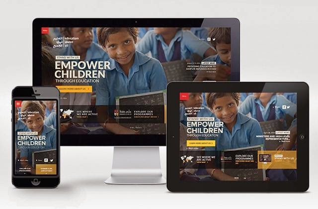
Startups cannot afford to lose any potential customers. And this is where a mobile first design enters the picture. Mobile is all set to eclipse desktop; this means there will be a lot of mobile users accessing your site. You must ensure that the site renders effectively on their devices and critical information is not lost when the site opens on mobile phones and tablets. This is the reason why startup websites need to be responsively designed to ensure they make optimum use of a device’s screen, irrespective of its size.

7. Devil is in the Details
Some designers are prone to taking the design of startup websites lightly. They follow a basic template, add a bit of content, use a few images and the website is done!
They forget paying attention to detail.
The problem here is that design detail is not just important, it is critical to a website’s success. Your images must be attractive and relevant, the design elements must be consistent across the various webpages, the typography must be readable and look good, all content on the website must be engaging and your website’s navigation must be extremely simple to use. This and a whole lot more helps make a successful website. You need to make sure your website’s design is just the way it needs to be.
8. SEO Friendly
Make sure that your website is SEO friendly and this doesn’t mean friendly for the search engines, but accessible to the people who are searching for information on your site by using search engines. The golden rule of search engine friendly web design is you are not designing for search engines but for people. If you have a human focused design, it will be poised to rank well on SERPs. Your site must be easy to read, have good navigation, maintain design consistency, and must load quickly. If you take care of these aspects, you are essentially making your site SEO friendly.
9. Sticking to Fundamentals & Not Going Overboard
If your website sticks to the fundamentals of website design, it will not go wrong. A startup website needs to be able to make its point without going overboard with the visuals. People really aren’t interested in admiring its looks but want quick access to information that talks about its products/or services. So give them what they need.
10. Take it as a Challenge and Experiment
Challenge yourself to design a website that is everything that a startup wants and then some more. Push the envelope because it is imperative that a startup website stand-out from the crowd. Its design needs to shout the loudest. Do not hold back with your designing skillsets and build the confidence to do something different.
Source: justcreative.com