The time-honored tradition of typographic illustration
There once was a time when virtually everything was made by hand. It was simple, and the best way to get something done was to do it yourself. When the Industrial Revolution came along in 1760, it no longer made sense to make your own, well, anything. But there’s been a subtle yet significant shift towards handmade goods in the past few years, which includes the art of hand lettering.
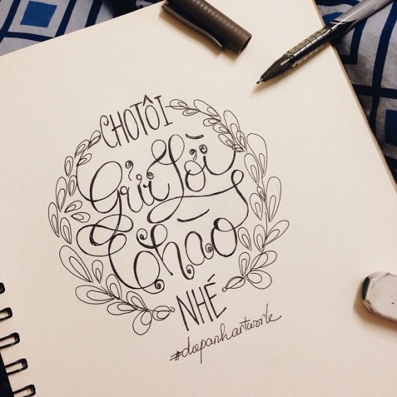
Today, hand lettering can be a lucrative career, which is made evident by successful artists like Salt Lake City-based Jill De Haan, San Antonio-based Sean McCabe, Bristol-based Tom Lane and Crowborough-based Ian Barnard.
“The rise of the script, both with hand lettering and typefaces, has garnered a large amount of attention in the past few years.” explains Shelley Gruendler, founder of the Adobe-sponsored Type Camp. “They fell out of favor for several decades after their ubiquitous use in the 1950s and seem to be back with a vengeance. The great thing about typography and letterforms is that there are thousands of approaches to the thousands of situations that need it,” she adds. “It is a constantly evolving media and will prove to be of interest for centuries more to come.”
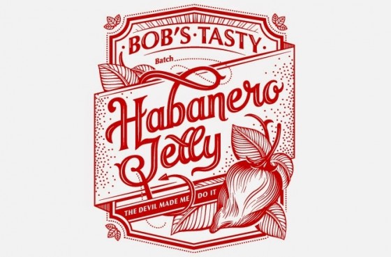
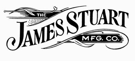
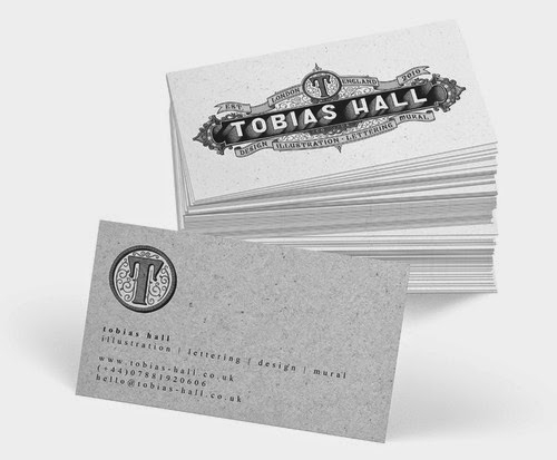
What makes a successful typographic illustrator? Aaron Schwartz discusses his work with hand-lettering and how its newfound popularity has changed the art form…
How long have you been making hand lettering illustrations? And what interested you about this particular art form?
I only heard of the term “hand type” in my second year of university and always enjoyed working by hand. So when I wasn’t finding work right away after school, I worked odd jobs and spent my evenings at home drawing.
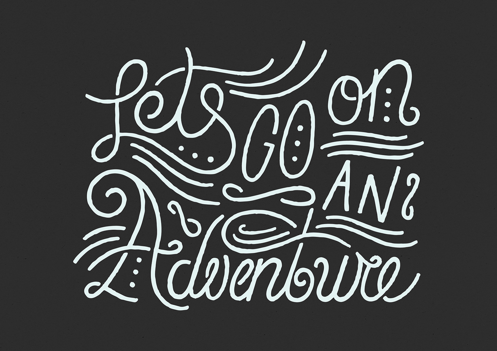
When you look at a finished piece, the character and personality of a human behind it all is still very much visible. Be it slightly crooked lines, little imperfections, odd spacing — those things are apparent and make a piece unique and personal. I love that. In an age where it’s easy to set type digitally and space it, kern it, adjust it, I find joy in working on a longer kind of process, where happy mistakes happen and are appreciated.
Where do you draw inspiration for your work?
Inspiration can be found everywhere. Signage, wayfinding, infographics, billboards, murals, ads, posters, flyers, magazines, books, tattoos, you name it. Then there’s the digital side: Instagram, Behance, Designspiration, Dribbble, and all those platforms where people share their work. I’d say I’m most inspired by the sheer fact that there are so many great lettering artists out there, to a degree doing a similar thing, yet none of it is the same.
What tools do you use to create your hand lettering pieces?
I usually start with little pencil sketches and doodles. Then I go through a process of drawing larger versions, at this point with fineliners and markers, then scanning, printing, tracing to get to the point where I feel like it’s finished enough to move over to Photoshop and Illustrator to make the final touches. A finished piece can end up living as a digital file, with nearly-done originals on paper in a box under my desk. What tools I use always depend on the project, what I’m drawing on, what the use of it is in the end. But more often than not it’s pencils, markers and mouse-clicks.
Source: herschelsupply.com