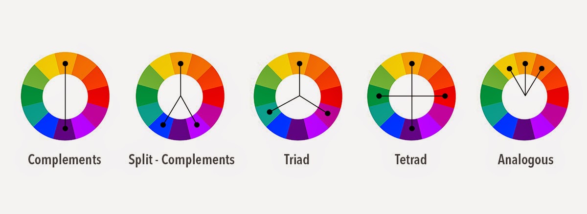
When studying colour theory we are given an understanding of the colour wheel and the harmonious relationships that can be forged between these brothers of reflecting light… It is here that we are given a cheat sheet on how to use colour effectively to communicate the right message.
Below we use this knowledge to go behind the scenes of colour theory in logo design while looking at various case studies of logo designs that use these principles. Enjoy.
The Colour Wheel

This wheel, that shows the relationships of colours, is a handy little tool to understand. Without going into any great detail of how the colours of the wheel are established (which is pretty interesting to know), we’ll just tip or toes into the water.
The panels that have an outline above, with their linking lines, show the relationships colours have. For example, complementary colours are the colours directly opposite each other. In our illustration above (the first wheel highlights the relationship), red and green are directly opposite, so they’re complementary. Just as the blue on the left and the yellow on the right are complementary, the orange and light blue, and so on.
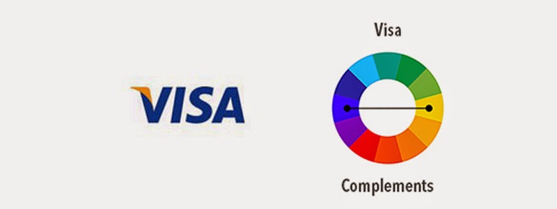
Visa – Complementary

This is a great place to start. This is as straight as it can be – direct complementary colours, no ifs, no buts. Yellow is directly opposite blue, so there isn’t a lot to talk about in this regard really, other than the yellow is a little orange, but let’s not too picky. Let’s have a look at the meaning of the colours.
Visa WheelBlue is a colour often associated with trust, loyalty, royalty, friendliness, wisdom and peace. It can also be associated with the less noble feelings such as depression, but given the context, not an association easily made—especially with our optimistic, wealthy and joyful yellow sitting calmly on the shoulder of the logo.
Remember, colours have a multitude of different meanings for different people – it’s all about context and the brand as a whole.
Wisdom, wealth and trust — what more could one ask for from a company at whom we throw wads of cash?
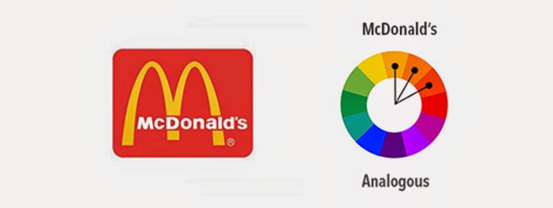
McDonalds – Loosely Analogous

When I was younger I saw a documentary in which the McDonalds logo was discussed. I particularly remember a man making mention of the feeling that the red and yellow evokes – hunger. At the time, this idea fascinated me for at least a moment as I remember wondering how that could even be. Being a child, I probably put it down to magic or elves or.. something. It’s fun being a kid. Flash forward however many years and we have Wikipedia, with, under it’s entry for colour psychology; “Studies show that red can have a physical effect, increasing the rate of respiration and raising blood pressure; red also is said to make people hungry.” So maybe not elves after all.
Red can understandably cause a feeling of hunger—it’s the colour of the flesh, blood and health – maybe it isn’t only a modern day thing, maybe it’s an evolutionary association we have? Red also cues thoughts of speed, which is what fast food chains pride themselves on.
Then there’s the yellow. Again, Wikipedia informs us that yellow is the colour of joy and happiness, sociability and friendship. With their focus on children on the playground and friends grabbing a quick bite whenever out, yellow seems like an obvious choice. If you can associate your business with being part of any outing routine, you’re doing something right.
Ironically, while this combination has undoubtedly influenced many, many fast food chains, it’s also the colours of danger, death and panic – although some do think of these when eying the golden arches.
Or, you know, it’s just ketchup and mustard.
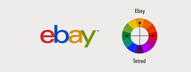
Ebay - Tetrad

The four colors are roughly evenly spaced across the color wheel, which is a basic approach to creating complementary colors. Colorful palettes create a sense of openness, diversity and optimism, which are positive for a consumer brand.
Source: logodesignerblog.com